Ad Help Day
So… What is “Ad Help Day”? It’s a philanthropic event, sponsored by the American Advertising Federation, that I think is best explained in their own words:
“The goal of Ad Help Day is to connect non-profit organizations in need of marketing and advertising assistance with our members who are willing to volunteer their time and expertise.”
I love “building something from nothing” in the first place… and it is extremely gratifying knowing my assistance helps out a non-profit organization in the process. I jumped at the opportunity to volunteer for Ad Help Day and am excited to tell you all about it. Scroll down to read more about my process, collaboration, and results.
How I Helped
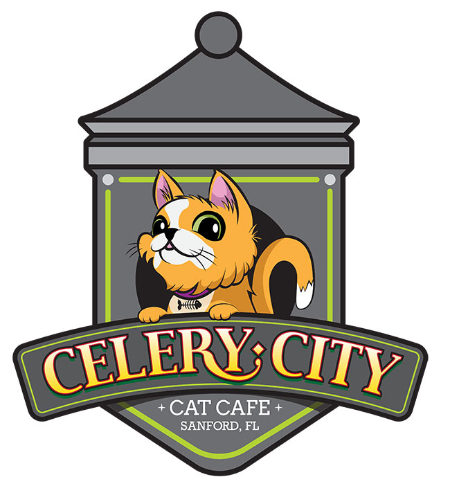
For this project, I was linked up with the lovely Dara Edmonds; founder of Celery City Cat Café. I sat down and listened to her vision for her non-profit- including growth plans, branding ideas, competitive analysis, and overall goals.
We decided that the best course of action was to start with the overall look and feel, branding, and aesthetics for Celery City Cat Café- with emphasis on it’s hometown location of Sanford, Florida; nicknamed the “Celery City”.
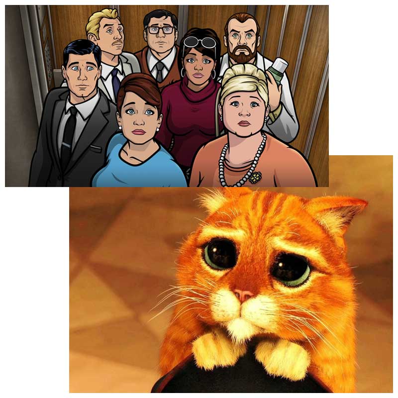
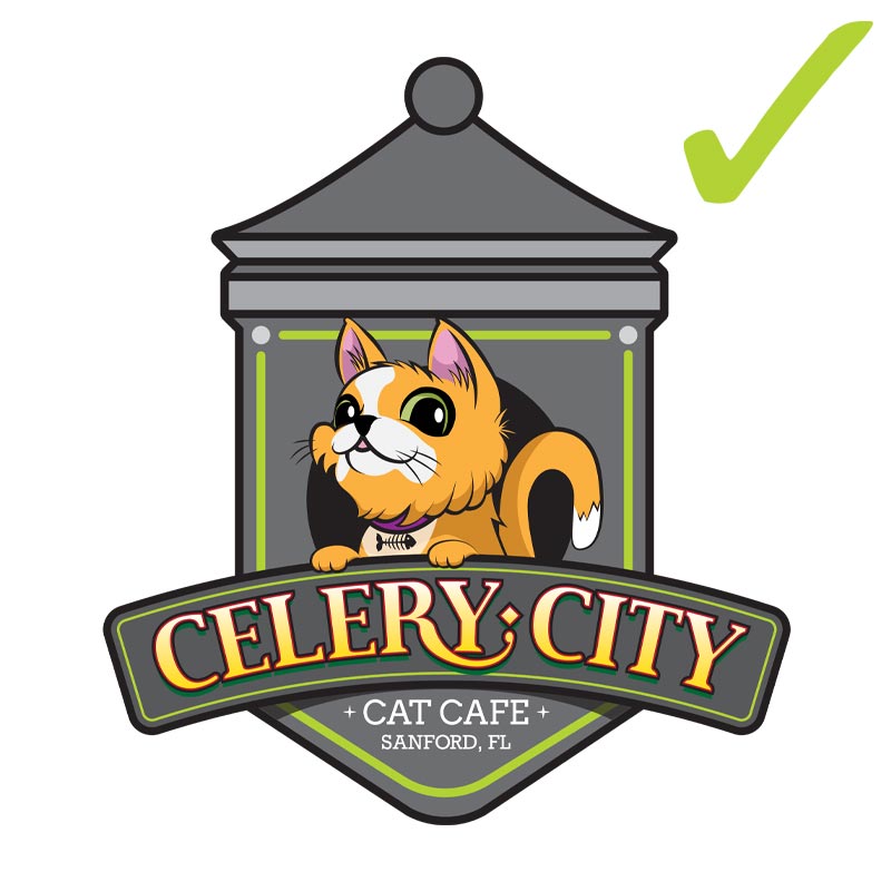
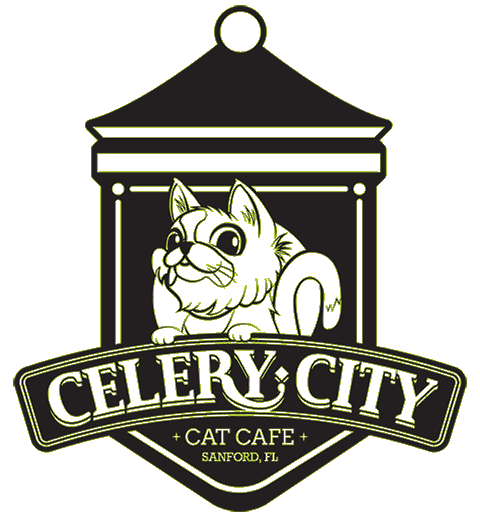
Over the next few weeks, I collaborated with Dara to create a logo and branding guidelines for Celery City Cat Café. I incorporated her inspirations (everything from the Archer TV series to Lucky Cat tattoos) and implemented a creative process to consolidate everything into a logo that she is still proud of to this day. Scroll down to read more about the creative process that got us across the finish line.
Creative Process
For Celery City Cat Café’s logo and branding guidelines I used a process I call “The Three I’s”: Inspiration, Implementation, and Iterations. Please read below to learn more about the creative processes involved.
STEP 01:
INSPIRATION
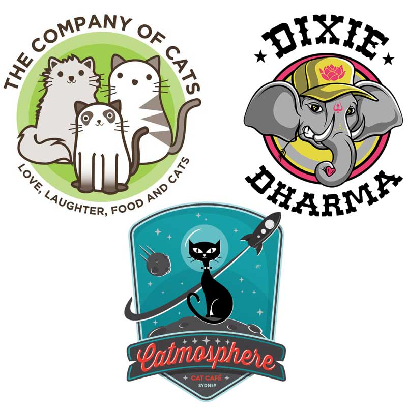
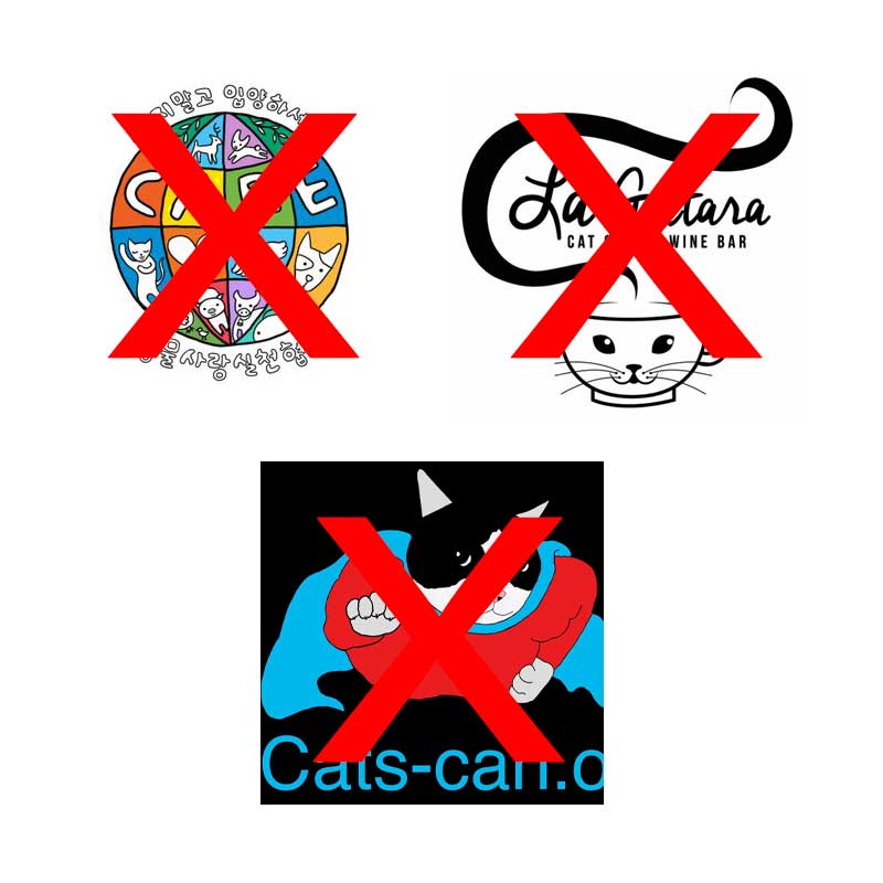
The first thing I do before designing a logo is ask for inspiration from the client by asking them for 3 logos from a similar service/product that they like (and explain why), and 3 logos from a similar service/product that they don’t like (and explain why).
Maybe the color of one logo symbolizes something special for them. Maybe they just like a clean font style. Maybe they’re turned off by circles for some reason? Whatever the case, it is during this part of the process that I can really “see” what the client wants and have an idea of their general design preferences. Now it’s time to implement…
STEP 02:
IMPLEMENTATION
After receiving examples and feedback from the client, I then use elements, colors, fonts, styles, etc. from those examples to create quick, copy-paste designs. These designs let the client see the progression of the design and allows for more feedback throughout the process.
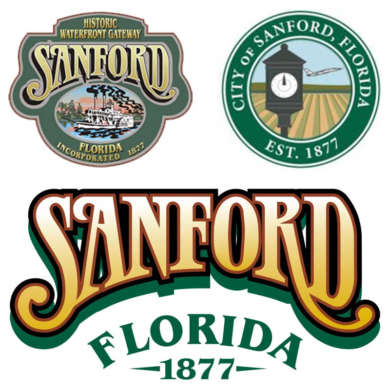
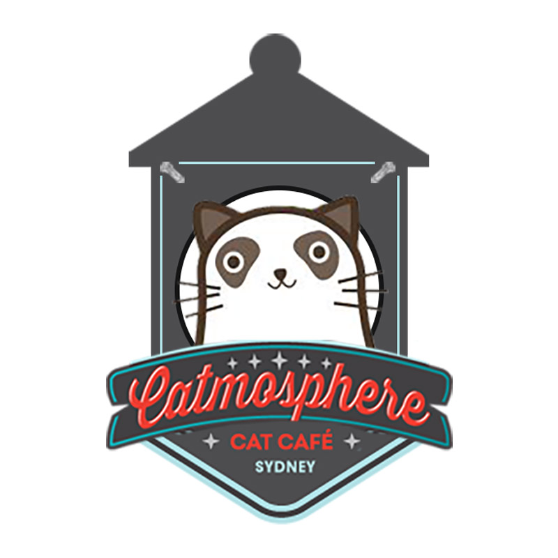
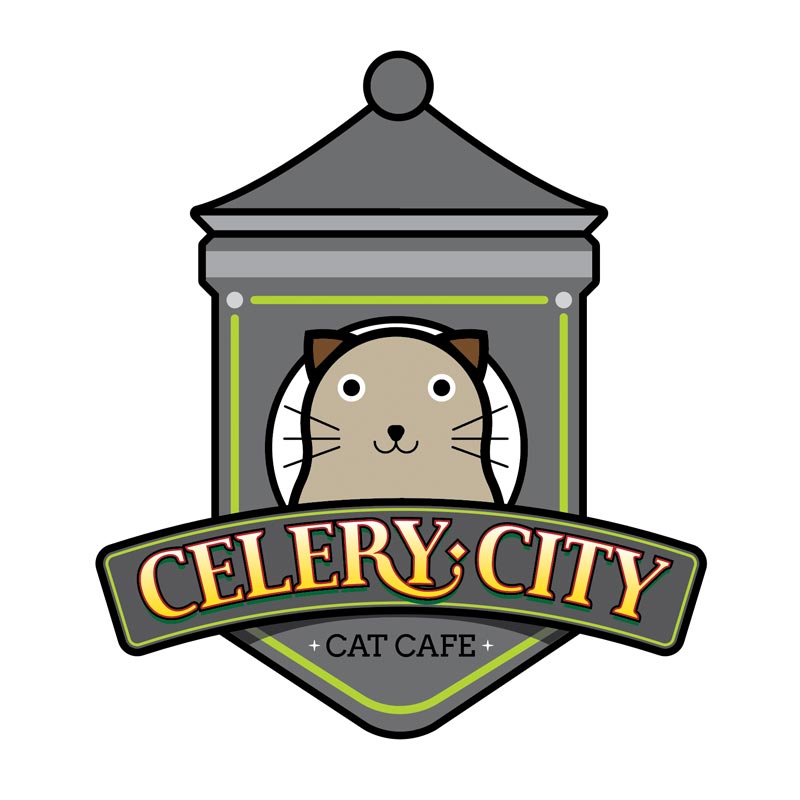
In Dara’s case, she liked the bottom band, accent lettering, and gray color of the Catmosphere logo, the green color and simplistic cat shapes from the Company of Cats logo, the thick-lined cartoonist style of the Dixie Dharma logo, and the lettering and style from the City of Sanford logo.
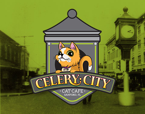
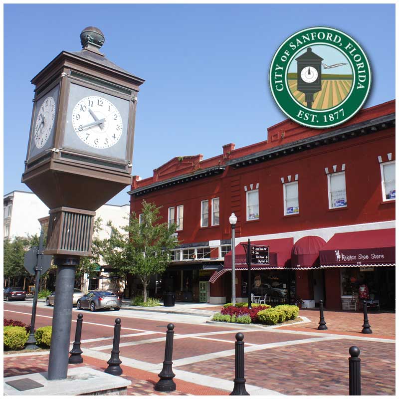
Continuing the hometown-of-Sanford feel, I suggested that we incorporate the “Famous Clock in Downtown Sanford” as the background shape. The historic clock is also gray, so Dara’s request of a gray background fit in perfectly- all while giving the “nod” to Sanford.
STEP 03:
ITERATIONS
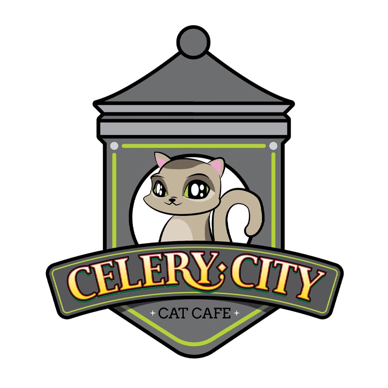
The final step in this process involves the iterations. Now that the client has agreed to an overall look and feel, I can narrow down the multiple variants into a single logo. From that single logo, I fine-tune all the design details and start playing “version ping-pong” with each iteration.
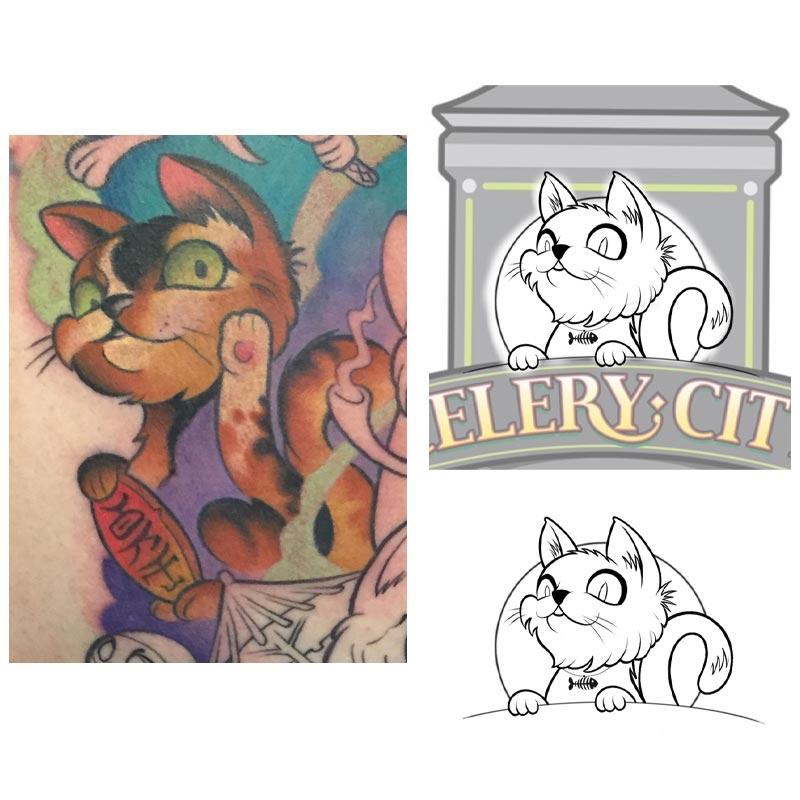
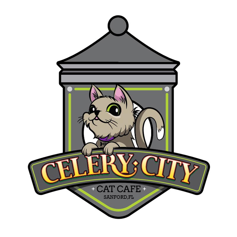
For Celery City Cat Café, we were close to a final design- but something was still not quite hitting the mark: the cat in the center of the logo. We were a few versions in, using the thick lines of the Dixie Dharma logo example, when it clicked… Dara (the client) had a work-in-progress tattoo- with a lucky cat in it- that was perfect for the occasion! I photographed, vectorized and incorporated her tattoo into the final logo, now giving a personal meaning to Dara, and a local connection to the city of Sanford. Both of us couldn’t be more pleased with the results…
